Troy Shantz
Many a Sarnian driving home at night on that final, lonely stretch of Highway 402 have wondered about the irregular spacing of the five lights illuminating the “Sarnia” sign just east of the airport.
The alignment of the lights strikes the eye as odd, so much so it recently touched off a hot debate on social media.
So what’s up with that?
The Sarnia sign was unveiled shortly before Christmas in 2001 and spearheaded by Peter Hungerford, the city’s former director of economic development and corporate planning.
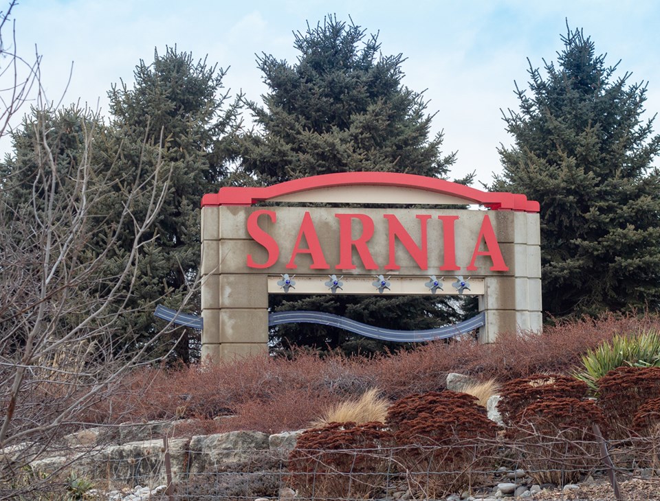
Designed by David Gilchrist Architects & T.W. Gray Engineering, it is dominated by a large concrete arch representing the Blue Water Bridge and St. Clair Tunnel, according to a press release from the day.
A blue ‘wave’ evokes Lake Huron and the St. Clair River, and a red arch across the top alludes to the bridge’s second span, completed in 1997.
Fittingly, limestone rocks used in the landscaping came from the original rail tunnel built beneath the St. Clair River in 1889.
But why are the lights misaligned?
According to the city, they’re positioned that way to better illuminate each of the sign’s letters, so symmetry be damned.
“They don’t point straight up onto the letters, they cast light to either side of it,” explained city engineer Mike Berkvens.
Even the five lily-shaped light fixtures are symbolic, having been reproduced from the City of Sarnia crest.