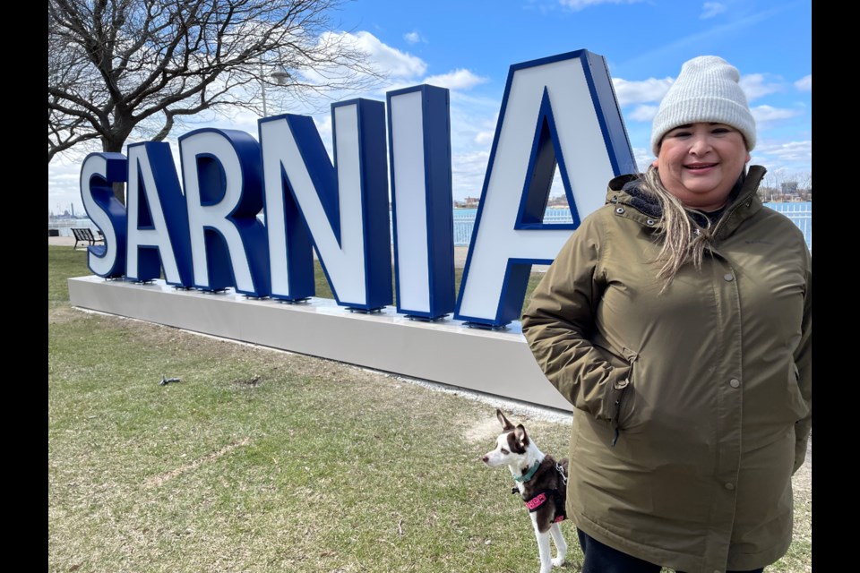
Centennial Park is home to a new sign sporting six-foot letters that spell out SARNIA. And, like many things in our fair city, the $132,000 sign has sparked a lot of online conversation.
Some folks love the idea that the City of Sarnia – with a $55,000 contribution from Imperial Oil – has invested in a feature that is bound to attract tourists and lots of beautiful waterfront photos. They can’t wait to see the sign lit up in colourful lights at night.
However, others aren’t sold. Many online comments lament the positioning of the sign and suggest it should be turned around so that the letters aren’t backwards when viewed from the water. Others want the new sign to be double-sided so it reads correctly from both sides.
Still, others wish the city had spent the money on something else that they feel is more pressing.
The Journal headed out to talk to park users and found opinion split in a very small (unscientific!) poll. We asked, “Do you like the new sign?” and this is what we were told:
PRO - SARA DUQUE (Sarnia) - “It’s excellent. I love it for photos. Yes, it’s the right way around with the water behind it to make a very beautiful view.”
CON – NADINE WARK (Sarnia) – “I don’t think the sign is necessary. The money could have been better spent. But I will say that it’s nice to see the fence that was on this site for so long is finally gone.”
PRO – KERRY GABRIEL (Sarnia) – “As you walk or cycle or drive down Front Street, this installment is beautifully framed by the trees, green space and the waterfront. Walking along the waterfront, realizing you can put that beautiful view in the background of your photos, it makes perfect sense for tourists and residents. When I was there the first evening the sign went up, I had four different couples ask if I could take a shot of them in front of SARNIA. It’s literally picture perfect.”
CON – JONATHAN WALKER-CLEMENTS (Sarnia) – “I get the tourism aspect but the roads in Sarnia need the money more. I would have preferred it if the money went there. I’m never going to take a picture with it.”
PRO – TYLER GRANT (Petrolia) – “I like it. I think it should be double-sided so it looks right to people who are out in the water. But otherwise, I think it was a good idea.”
CON – MARK CARTER (BRIGHT’S GROVE) – “No, no, no. It’s in the wrong place and it’s the wrong way around. It should have been in the park at the foot of London Road so you would see it as you came over the hill. As it is, it doesn’t look right from the water and when the leaves are out, you won’t see it unless you’re in the water.”